poli-sci
Tuesday, November 23, 2010
Offshore Drilling
This graph explains the view changes on offshore drilling from April 2009 to Oct 2010. Those who favored offshore drilling went from 68% in April 2009 to 51% in October of 2010. And those who oppose offshore drilling increased from 27% in April 2009 to 41% in October of 2010. I think a lot of this has to do with the huge oil spill in the gulf. People are started to recognize the risks of offshore drilling. I personally am not i big fan of offshore drilling because the risks outweigh the rewords.
Tuesday, November 16, 2010
Less Enthusiasm
This first graph shows the level of Enthusiasm about party victories in 1994, 2006 and 2010. In 2006, 60% said they were happy the democrats won, while 24% were unhappy. In 2010, only 48% said they were happy the republicans won, while 34% were unhappy. I think there is less enthusiasm now because the state of our economy and the unemployment rare.
The second graph shows the approval of each party's plans for the future. In 2006, 50% approved and 21% disprove. In 2010, 41% approve while 37% disapprove. This shows that the people are split with there opinions on the republicans plans for our future.
Monday, November 1, 2010
Obama's religion linked to job approval?
This chart shows the perception of Obama's religion and how its linked to job approval. Of the 47% who approve of his job performance, 62% believe he is a christian. 41% disapprove of his job performance and of that 41%, 67% of them believe he is a Muslim. This basically comes down to the the republicans who disapprove of Obama's job performance, are calling Obama a Muslim because they want him out of office. I think it is sad that our nation doesn't even know what our presidents faith is.
Monday, October 25, 2010
This chart shows the breakdown from party to party of who thinks Obama should should run for reelection in 2012. 83% of democrats think he should run again but only 37% of independents believe he should. There is a +71 difference between democrats and republicans, which is that the largest differential between the four presidents in this graph.
pewresearch.org
pewresearch.org
Monday, October 18, 2010
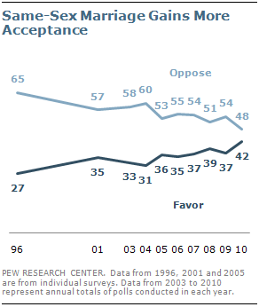
Same-Sex Marriage gains more acceptance
pewresearchcenter.org
This graph shows an increase in the support/acceptance of same-sex marriage since 1996. As you can see by this graph, Americans have come along way since 96. Acceptance has increased from 27% to %42 in this period. While acceptance is increasing, those who oppose it have gone down from 65% in 96 all the way down to 48%.
Monday, October 11, 2010
Independents Oppose Party in Power ... Again!
pewresearchcenter.org
This chart shows the independents in 2006 and 2008 favoring the democrats 53% to 45%. Now in 2010 they favor the republicans 50% to 43%. This tells me that the independents are never happy with the current party in office.
Monday, October 4, 2010
Obama's policies Biggest factor in Independent votes
source:pewresearch.org
This graph shows how the independent voters plan to vote in the next election. For the most part they are split down the middle.Of the independents who plan to vote for Obama, the majority believe he is making the economy better. and those independents who plan to vote for the republican party, most believe he has made the economy worse. I am not surprised with this information at all. Obama had a lot more support from the independents in the 08 elections but still has support of many of them.
Subscribe to:
Posts (Atom)


